Assignment 4
Possible second perspective view...not perfected Immersive Perspective of upper breezeway
Section Perspective
Sunday, April 29, 2007
assignment 4
Posted by
jan
at
6:23 PM
2
comments
![]()
Saturday, April 28, 2007
Sunday, April 22, 2007
Assignment 3
ASSIGNMENT 3
SECOND VERSION OF DESIGN
Section Perspective Immersive View 24mm
 Immersive View 24mm
 Elevation
 Plan
Plan
ORIGINAL DESIGN
Axon
Section Perspective
Elevation View
Plan View
Immersive View
Two-point perspective with a focal lenght of 24.. Immersive View
 Immersive View
Posted by
jan
at
9:51 PM
0
comments
![]()
Saturday, April 21, 2007
Tutorial
Photoshop Tutorials
http://www.peamarte.it/02/template/tutorial/stencil/stencilt_tut.html
3d Text Tutorial
Voidix
http://www.voidix.com/illustrator_easy_3d_text.html
By doing this i learned how to make 3d text quickly and how to manage the angle and glow of the text. By using the 3d extrude and bevel option a variety of different options are available with the text and thats exciting. 
Glassy Buton Tutorial
n.design studio
http://www.ndesign-studio.com/resources/
This was an illustrator tutorial for how to create a glassy button icon. I learned how to make a circle path and how to fill space with color. I also learned to overlay a transparent field in order to add the effect of a reflective light.
Posted by
jan
at
2:21 PM
0
comments
![]()
Sunday, April 15, 2007
centralized
CENTRALIZED
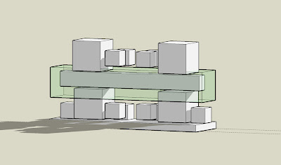
In my centralized design I interpreted the floating beam within the transparent tunnel as the main focus. The box elements are dependent upon this central emphasis both structurally and visually. Although the boxes create a unique experience, especially with the light that leaks between them, they are not the dominant feature in this design. From every space ones eyes should in some way be linked and drawn to the floating interior space. Axonometric View
 Plan View
 Elevation
 Eye Level
 Immersive View 1
 Immersive View 2
Posted by
jan
at
11:11 PM
0
comments
![]()
Distributed
DISTRIBUTED
This design attempts to balance the weight of structure, void, and light throughout the site. The elements are more compact which develops the feeling of connectivity and wholeness. The word distributed in this particular design refers to the fact that the individual pieces are distributed and not focused in one area. No single piece demands visual attention above the rest. Looking into the space within repetition of shape and light support this idea of balance. Axonometric
 Plan Elevation
 Longitudinal Elevation
 Eye level
 Immersive View 1
 Immersive View 2
Posted by
jan
at
10:36 PM
0
comments
![]()
Hybrid
HYBRID
This design tries to integrate ideas in the distributive and centralized models. Similarly to the centralized design this maintains a strong central feature in the heart of this site. The fact that the beam within the transparency does not exactly touch the other boxes it is clearly defined as unique. Drawing upon the concepts of the distributive design the boxes are placed in a way that balances the floating central element. Axonometric
 Plan Elevation
 Longitudinal Elevation
 Eye Level
 Immersive View 1
 Immersive View 2
Posted by
jan
at
9:49 PM
0
comments
![]()
Sunday, April 8, 2007
Isometric View Of The Subtractive Approach

I tried to integrate the space within and the outer space in order to create the sensation of indoor outdoor living. The design was meant to feel light and open, but also intriging. From the space within the horizon and views are expansive and vivid. There is a feeling of upward movement that is balance with lower peak holes.
Posted by
jan
at
9:44 PM
0
comments
![]()
Isometric View Of The Additive Approach

The upper and lower portions have a weighted feeling but in between there are different holes looking outward. This allows for a sense of enclosure without feeling trapped. Lower portions are shaded by floating elements that hang above. The overall design has a very strong center.
Posted by
jan
at
9:12 PM
0
comments
![]()


